How to build React Reusable components faster with Aspect?

Aspect allows developers to create react components virtually in the browser. Using this tool you can eliminate the extra load of creating and setting up react development projects. There is a drag and drop functionality available that makes it easy to create react components. Aspect offers a way to sync the design to the code base. Additionally, professionals can export it as a zip file.

It’s not limited to that only. This new concept for react reusable components is more than that. There are lots of cool features available that include support for libraries like Tailwind CSS, and Material UI.

How to get started?

To begin with Aspect, you first need to sign up. Later on, install the Aspect CLI globally using the following command.

Npm install @metacode-inc/aspect -g 

After that, the aspect will create a new project with an empty view to begin.

Project Overview:

react reusable components aspects

The user interface will have the following different sections: You need to follow these sections for creating react reusable components.

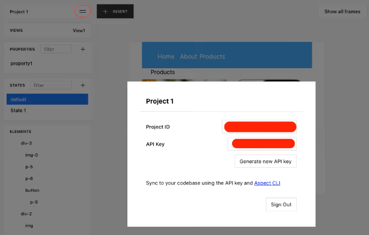
Project: Here you can view the list of your project’s details like Product ID. Also, you can generate, view and synchronize the codebase. 

Views: Create the different views for the project.

Properties: Here you can define the project’s custom properties. 

States: Create the custom states and set the conditions for the elements in the project. 

Elements: Managing the elements in the projects and defining the hierarchy for the same. 

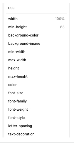
CSS: It is used to define the project’s styling and use the quick layout to organize the elements. 

+Insert: Add the filter and also add elements to the project.

Creating a View:

There is a three-part AMP structure:

Clicking on the + symbol on the VIEWS tab will create a new view. After that click on View2 and then rename it as “Product.”

Adding elements:

Creating a parent layout:

Now by clicking on +INSERT and selective div from the dropdown, we will start by adding the parent div. Once you hover over the view, you should see a +symbol. It means the element has been added. Now you will right-click on the element and then drag it to enlarge the element to the desired size.

react reusable components

Creating the navbar:

Now you have the parent layout where you add another div for the navbar. Now you repeat the same steps you followed to add the parent div. After that, go to the CSS tab and set the min-height to 63 and width to 100%.

Following will be the look

react reusable components

Now you will use a ul element to add some navbar lists to the project. Click on INSERT and select ul, after that add it to the parent div, -div-o.

Add the three li list item elements in the ul element and the p element in the li elements. Add home, about and product to the text property in the properties tab.

Add the text to the p element and then click on CSS>QUICK LAYOUT tab to add the style. Now select the first layout to show the contents inline.

creating-navbar

Now change the list-style property in the ul element to none. Specify the background-color of #42a7f5 for the div-0.

The next will be changing the font to while and align the element. You can do this by adding margin-right of 7px and color #fff to each li element.

Creating Products:

Now, make a layout for the products using the p element for the product description. After that, you will create the child layout for the product.

Insert the div, and inside of that, also insert another div. Inside div-1, add p. Change the text property of p-2 to the “product”.

Click on the div-1 and then go to the CSS>Quick Layout tab. It will help to style the child’s layout. Now change the width property of div-2 to 100% while selecting the second layout.

react reusable components

Inside div 2, insert another div to hold the product details. Now insert one ‘image’, two ‘p’ and one ‘button’. Now change the text property of the p-3 element to Techno m16. Change the text property of the P-4 element to Price: $200. Now set the text property to “Add to card” and add p to the button.

Changing the font-size properties to 12 ppx for all the p elements. Also, set the aligned properties to the centre.

Click on the div-3 and then press Ctrl+D for duplicating the div. This will create div-4. Now go ahead and change the text.

Click on div-2, go to CSS>QUICK LAYOUT. Select the first layout.

Exporting the components:

Now, using the Aspect UI builder, we have finished creating our component. Let’s fetch the design and sync it with the codebase. For this, you need to follow the command below:

Aspect fetch --project - - out - - key 
react reusable components

By clicking on the project name in the Project dropdown you will get the project ID and API key.

Click on the Generate new API key button to generate a new API. The <apikey> is never generated by default.

You will see the following output after the successfully fetching and synchronization.

Fetching project components for Project with ID: -N3Yqe9KrJMGeuVemOMy...
Successfully fetched project components 

The aspect will generate the component.tsx and components.css file.

Conclusion:

Aspect is a good approach for the react developers to make their development work time saving and effective. It is a good concept if you want to make the react reusable components working within the time frame.
Share This Story, Choose Your Platform!